The Brand War That Made Every Gas Station Look Like Every Other Gas Station
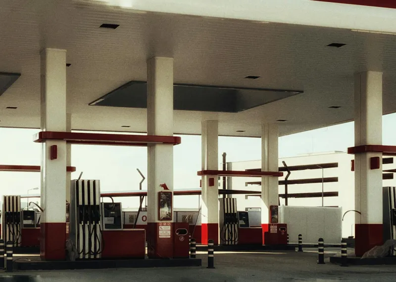
Drive across America today, and gas stations are remarkably uniform. Whether you're filling up in Maine or California, you'll find the same basic setup: canopy over the pumps, convenience store with large windows, restrooms around the side, and corporate colors that scream brand identity from a quarter-mile away. This visual consistency isn't accidental—it's the result of one of the most successful corporate design campaigns in American history.
But it wasn't always this way. In the early days of motoring, buying gasoline was an adventure in uncertainty, and the story of how oil companies transformed chaotic roadside commerce into a predictable, branded experience reveals how corporate America learned to compete through architecture.
The Wild West of Early Fuel Sales
Before the 1920s, buying gasoline was like playing retail roulette. Motorists might find fuel at a blacksmith shop that kept a few cans out back, a general store with a hand-cranked pump by the front door, or a converted barn where the owner stored barrels of gasoline alongside farm equipment.
These early fuel vendors had no visual identity beyond whatever building they happened to occupy. A "gas station" might be indistinguishable from any other rural business—just a wooden structure with a handwritten sign advertising gasoline for sale. Quality was inconsistent, prices varied wildly, and drivers had no way to predict what they'd find at any given stop.
The situation was particularly chaotic along the emerging highway system, where entrepreneurs rushed to set up fuel stops wherever traffic seemed heavy. Some operated out of modified chicken coops. Others simply parked tank trucks by the roadside and sold directly from the vehicle.
The Trust Problem
By the early 1920s, major oil companies faced a serious challenge: how do you convince drivers to choose your gasoline when they can't tell one station from another? Standard Oil, Texaco, Shell, and other petroleum giants were producing millions of gallons of refined fuel, but their products were being sold through thousands of independent retailers with no brand loyalty or quality control.
The companies' first instinct was to focus on the product itself—advertising gasoline quality, engine performance, and fuel efficiency. But they quickly discovered that most drivers couldn't distinguish between different brands of gasoline once it was in their tanks. What mattered more was the experience of buying fuel: Was the station clean? Did it look trustworthy? Could you find it easily from the road?
This realization sparked what industry historians now call the "architectural arms race" of the 1920s and 1930s.
The Design Revolution Begins
Standard Oil of California fired the first shot in 1915 by hiring professional architects to design a standardized station prototype. Their breakthrough insight was that the building itself could serve as a three-dimensional advertisement, instantly communicating brand identity to passing motorists.
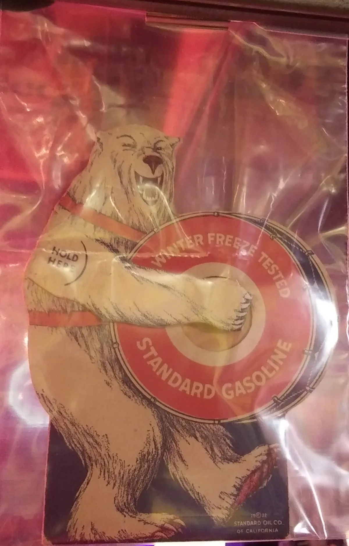 Photo: Standard Oil of California, via d3h6k4kfl8m9p0.cloudfront.net
The company's first standardized design featured a distinctive red tile roof, white stucco walls, and carefully planned landscaping. More importantly, it established the basic layout that would eventually become universal: pumps positioned under a protective canopy, with the main building set back to create a drive-through experience.
Competitors took notice immediately. Texaco hired New York architects to create their own distinctive design language, featuring star logos and a specific shade of red that could be spotted from great distances. Shell commissioned a series of whimsical shell-shaped buildings that were impossible to miss or mistake for competitors.
The Science of Recognition
As the design war escalated, oil companies began investing serious money in what we'd now call brand psychology. They hired color consultants to choose paint schemes that would be visible in all weather conditions. They studied traffic patterns to determine optimal building placement and signage height.
Mobil's flying red horse became one of the most recognizable symbols in America partly because the company's designers calculated exactly how large the logo needed to be for drivers to identify it at 35 mph from 500 feet away. Every element of their stations—from the height of the canopy to the placement of the service bay doors—was engineered for maximum brand impact.
Texaco went even further, creating a comprehensive design manual that specified everything from the angle of the driveway entrance to the font used on price signs. The company's "registered rest room" program established cleanliness standards that became a competitive advantage, with specially designed tiles, fixtures, and even toilet paper dispensers that reinforced brand identity.
The Franchise Revolution
The real breakthrough came when oil companies realized they could license their designs to independent operators. Rather than owning every station, they could create a network of franchised locations that looked identical and met corporate standards while being locally owned and operated.
This franchise model solved multiple problems simultaneously. Oil companies could expand rapidly without massive capital investment. Local entrepreneurs could benefit from established brand recognition. And drivers gained the predictability they craved—a Sinclair station in Ohio would look and operate exactly like a Sinclair station in Arizona.
By the 1930s, the major oil companies had created detailed architectural specifications that covered every aspect of station design. These manuals read like construction blueprints crossed with marketing textbooks, specifying everything from the optimal number of parking spaces to the exact placement of promotional displays inside the building.
The Unintended Consequence
The ironic result of this intense competition was remarkable uniformity. As each company refined its designs to maximize efficiency and brand recognition, they converged on nearly identical solutions. The optimal canopy height turned out to be the same regardless of brand. The most effective building layout worked equally well for Texaco and Shell. Even color schemes, chosen for maximum visibility and psychological impact, began to overlap.
By the 1950s, American gas stations had achieved a level of architectural standardization that rivaled fast-food restaurants or chain hotels. A driver could pull into almost any station in the country and immediately understand the layout, locate the restrooms, and navigate the payment process without conscious thought.
The Modern Legacy
Today's gas stations are direct descendants of those 1920s design innovations. The basic layout established nearly a century ago—canopy over pumps, convenience store with large windows, restrooms accessible from the exterior—remains virtually unchanged. Even modern additions like car washes and electric vehicle charging stations follow the same principles of brand visibility and customer flow.
The corporate design war that began as a competition for market share accidentally created one of America's most successful exercises in architectural standardization. What started as an attempt to differentiate brands ultimately produced a landscape where every gas station looks fundamentally similar, regardless of corporate ownership.
The next time you pull into a gas station, take a moment to appreciate the design elements that make the experience so effortlessly predictable. That canopy protecting you from rain, the large windows displaying merchandise, the carefully positioned signage—all of it traces back to the 1920s architects who figured out how to turn corporate identity into built environments.
In trying to make their stations unique, oil companies inadvertently created America's most uniform roadside architecture. It's a testament to the power of good design that their solutions were so effective, competitors couldn't help but copy them.